Traits of effective design systems

I first started building websites in 2013, and the same problem kept coming up. Every new idea I had meant a lot of setup just to get a page laid out nicely. I’d be fighting with the CSS to get it just right, and then even more to make it display properly on a mobile. And because every project started from scratch, I’d repeat the process over and over – save some copy-pasta.
So when I discovered Bootstrap, I felt like I had been liberated. It was (and still is) a hugely popular library of reusable, customisable CSS classes for elements and layouts. I could get designs up and running quickly, my projects had a feeling of cohesion across each other, and things “just worked” out of the box in every environment. I was able to focus on the hard stuff while making sure it looked good (which was important to me due to my previous life as a graphic designer).
Fast-forward seven years, and I found myself on the team building and maintaining the Bank of New Zealand’s enterprise design system. Now I was the one providing developers with resources that “just worked” out of the box. The environment was vastly different, and the tooling had changed over the years, but the core problems being solved were the same. I spent four years on the design system team before moving into delivery teams that consume it.
This post outlines the key traits that I believe led to its impact and success.
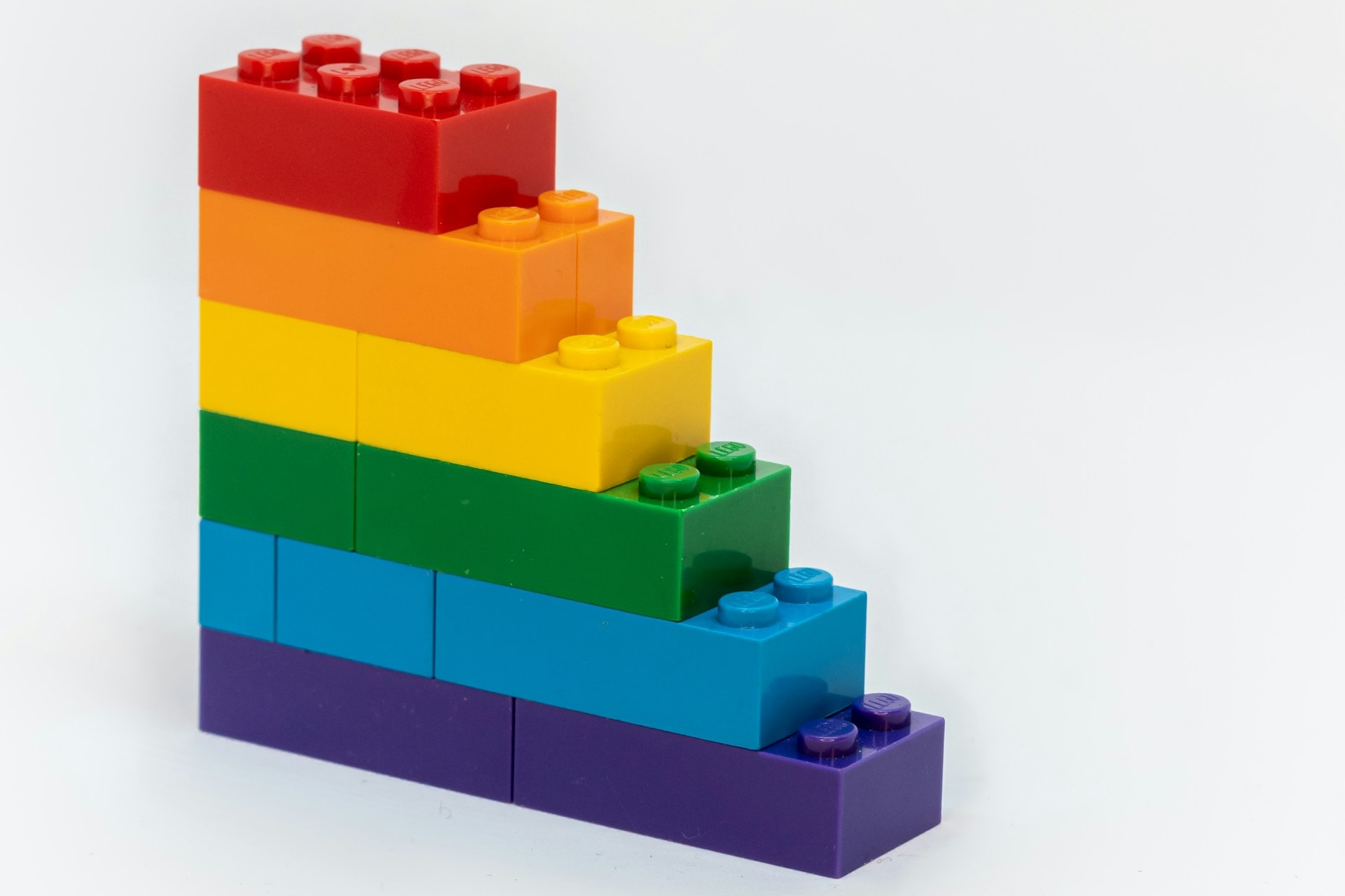
Photo: Xavi Cabrera | Unsplash
Design systems at a glance
So what even is a design system? At first it may sound like an incredibly ambiguous term, created by jamming two buzzwords together. In my opinion, Figma puts it best:
“At its core, a design system is a set of building blocks and standards that help keep the look and feel of products and experiences consistent.”
They provide the guidance and tools to create consistent experiences for end users. Modern design systems can usually be broken down into the following:
- A style guide that gives guidance on design language, tone of voice, and the general vibe you’re going for.
- Foundational elements such as typography, brand colours, logos, and core CSS units. These are often packaged up as design tokens.
- A component library that provides developers with reusable UI components.
- A pattern library that shows how components can be used together to create more complex interfaces.
- Reusable developer tools that support development, such as commonly needed functions, hooks, and CLI tools, and now AI skills.
- A team to manage it – while contributing to it on a voluntary basis can work, having a core maintenance team to govern it massively increases its health and impact.
- Design system 101: What is a design system? – Chad Bergman, Figma
- Design Systems 101 – Therese Fessenden, Nielsen Norman Group
Why use one?
There are a number of benefits to using a design system.
First of all, they help to produce a consistent user experience across various products and on different devices. You want your users to feel a sense of familiarity with your brand and experience, no matter what product of yours they’re accessing or what device they’re using. The reality is that if you have two separate teams working on two different products, their designs and implementations will differ. Design systems help to reduce that gap, making it easy for separate teams to create similar user experiences.
Secondly, they dramatically reduce the amount of time, effort, and work required for developers to ship user interfaces, because most of the components they need already exist, and to a high standard. If you need to create everything from scratch, not only will that take more time, but you’ll also need to make more decisions. Those decisions can be agreed on at the design system level, so you can spend more time on tackling real problems.
Couple this with the fact that UI components are “done once and done right”, leading to higher-quality components that are much less likely to contain bugs or other issues that could arise from building elements from scratch. Bugs are then caught once and fixed everywhere. If a UI component has an issue, it is fixed, and the issue is resolved everywhere it is used.
Thirdly, they provide massive leverage for your design resources. If you don’t have a design system, you’ll need more work and input from your design team. Utilising a design system enables core design elements and decisions to be already made, reducing the amount of design input needed and freeing up more time for designers to tackle the harder usability problems facing products.
And finally, they act as fantastic onboarding and educational resources. When new members join, they are able to upskill quickly using the knowledge and resources that have accumulated over the life of the design system. Designers, developers, and content team members are able to get up and running quickly, enabling them to deliver consistent, high-quality work faster.
Do we even need one?
Do you actually need a design system? Well, if you’re a small team working on small products, maybe not. But implementing one might help your design language stay consistent as you scale. Using an off-the-shelf one and skinning it with your theme would be well worth your while, given the minimal setup. You could also keep a small amount of documentation that captures the “vibe” you’re aiming for.
However, if you’re a medium to large organisation working on medium to large products, I’d argue absolutely yes. Sure, it’s an investment to create one, but it will pay off again and again. If you’re able to dedicate a team for it, even if it consists of one product manager/owner, one developer, and one designer, it will be 100% worth it.
Traits of effective design systems
With that, let’s go over the traits I’ve identified that enhance the impact of design systems.
1. They have buy-in from colleagues and leadership.
A design system offers its highest return when everyone contributes to and adheres to it. The more it is embraced, the more value it will give.
But a design system takes real resources to maintain. It needs the time of developers, designers, content specialists, and UX researchers, which has to come from somewhere. This is where buy-in from senior leadership matters. A leader who understands the value can make sure the system gets the funding and attention it needs and can go to bat for it when priorities compete.
Leadership support alone isn’t enough, though. You also need buy-in from your colleagues and peers, because they’re the ones who use it and contribute to it every day. A system that people work around delivers only a fraction of its value, and each person who adopts it makes it more useful for everyone else.
2. Everybody contributes to it.
Everybody has a part to play in maintaining the health of the design system, and everybody gets something back. It’s a common misconception that design systems are only for developers – this is not true. It involves and benefits everyone involved in the creation of a product. For example:
- UX researchers contribute what they learn and recommend, and in return get a place where insights become guidelines that every team can lean on.
- Marketing professionals contribute the tone and “vibe” of the brand, and in return see it flow consistently into every product.
- Designers contribute new components and design directions, and in return get commonly used components ready to fetch, meaning less rework and more time spent solving harder problems.
- Design system developers contribute by building and maintaining the component libraries and resources, and in return get a clear picture of how the system is used and where it falls short.
- Consuming developers contribute feedback and report gaps and issues, and in return inherit quality components, make fewer decisions, and ship faster.
If even one link in the chain above doesn’t respect the design system, it has an instant impact on its effectiveness through the introduction of inconsistency, workarounds, and tech debt – the very thing design systems are designed to reduce!
When everybody contributes, the design system acts as a hub encouraging consistency and cohesion, making collaboration a better experience, which ultimately flows through to better experiences for users.
3. They stick to the basics, and do them well.
User interfaces should be built using small, reusable components that can exist in a variety of contexts. A mistake I often see is components being too large. Components of a certain complexity should be broken down into smaller ones that can be composed together.
A popular methodology in design systems is atomic design, popularised by Brad Frost. The idea is that user interfaces are composed of small atoms, which can be grouped together to form molecules, which can then be grouped to form organisms, then templates, and finally pages.
- Atoms: the tiniest primitive building blocks such as buttons, labels, icons, and most HTML controls. Design tokens can also be thought of as atoms.
- Molecules: a small amount of atoms bound together. For example, an email signup with a label, input, and button could be considered a molecule.
- Organisms: compose molecules and atoms to build larger components, usually a decent chunk of an interface, like a menu.
- Templates: get closer to the final output, organising organisms, molecules, and atoms into a layout.
- Pages: are the actual pages that the end user sees. They will often be on a route and provide context down to the child templates and organisms.
The UX world moves fast. Keep design system components at the atomic and molecular level to preserve fluidity for changing requirements.
In my experience, adhering to these atomic design principles creates scalable components that actually have longevity. This is because things change and evolve over time – from the design direction to patterns and best practices. By keeping your design system’s components at the atomic and molecular level, they are much more easily adapted to new design trends as they arise.
This is opposed to having large, complex components that lock you into their API such that when things change over time, it’s much harder to adapt them without introducing breaking changes. You’d be surprised how quickly this can happen – components can have an effective lifespan of only a couple of years before becoming deprecated simply by not being flexible enough to adapt to new design requirements.
It is incredibly tempting to help consuming teams by having the design system components do as much lifting as possible to make it a super easy experience for the consuming developer. But this is a fool’s errand!
Let’s say you decide to help out a dev team by introducing a feature to a component that helps them calculate and display what they need. In the short term, it reduces work on their end, and everyone is happy.
But remember this feature is rolled out to every application that is using the component, which could include multiple dev teams working on different products and using different data sources.
Next, another dev team wants to use the component because it looks like it’s what they need. However, as they interface with a different backend and API that returns a different data structure, they find that they cannot use the component as intended. So they contact the design system team, which agrees to add functionality for their scenario.
And then a third team asks for functionality. You can see where this is going! Before long, you have a component bloated with business-specific functionality that other teams are entirely reliant on. It’s now beyond a basic UI component; it’s become a complex, bloated piece of logic!
The fix: keep UI components responsible for UI. It is the consuming dev teams’ job to implement their business logic, which can then be rendered in the component(s).
- atomic design – Brad Frost
- Component Driven User Interfaces – Chromatic
4. They are flexible rather than rigid.
I’ve found it’s better to err on the side of flexibility rather than locking components down to a tight configuration. It can be tempting to lock components down to avoid misuse and make them absolutely foolproof, but in my experience, this approach always creates more problems than it solves.
What do I mean by making components flexible? This means allowing custom content. This means allowing easy styling of the component and ease of overriding defaults. And basic things like allowing generic HTML attributes to flow down to the element, rather than restricting the available properties. Sure, this could mean developers could run amok with your components, but in practice, that’s rarely their intention.
By allowing flexibility, our components:
- Reduce the likelihood of workarounds
- Are suitable for use in many different contexts
- Can adapt easily to meet new requirements
- Do not block consuming developers from doing their work
- Reduce the likelihood of breaking changes
That doesn’t mean having no guardrails. Some things are worth being strict about, such as accessibility fundamentals and core brand elements like logos, colours, and typography. The key is to be deliberate about what you lock down, and to keep it to the things that protect users and the brand, rather than the things that merely feel tidy.
Be firm on principles, but loose on implementation.
In short, we should act as “stewards” who help, direct, and encourage design system users to make great decisions, as opposed to acting as “guardians” enforcing strict processes onto them, refusing to budge.
5. They make it easy to create accessible experiences.
Web accessibility is the practice of designing and developing digital experiences that cater to a wide variety of user needs, and that are operable on many different devices and technologies, such that everybody can consume and interact with the product regardless of their abilities or disabilities.
Read more: Introduction to Web Accessibility
There is a common misconception that accessibility can be “baked in” to components, such that consuming developers do not need to worry about accessibility. This is not entirely true.
Sure, we can bake in some things, such as making sure a component has sufficient colour contrast and that it uses the correct semantic tags, landmarks, roles, and aria attributes.
But accessibility, more often than not, is about conveying meaning. We need to rely on the consuming developer to add the correct labels or alternative text to convey the meaning of an element or control.
What we can do in this regard is make it easy for developers to create accessible UIs. There are a few ways we can do this:
- Make first-class props for labels, alternative text, or other accessibility info. Use TypeScript or Prop Types to mark them as required. This enables developers to see directly in their code editor that they are required.
- Provide an accessibility section in the documentation for the component.
- Make sure component examples are marked up accessibly.
Similarly, for elements that are purely presentational and don’t need to be added to the accessibility tree, developers need to mark these as presentational to prevent duplicate information – for example, a screen reader reading a heading twice.
I’ll give you an example: let’s say we have a cross symbol (×) in our icon library. This could mean a few things, such as “Cancel”, “Close”, “Discard”, or “Don’t do this”, or it could be purely decorative – the design system cannot necessarily know the context in which it is used. It’s up to the developer to label it correctly based on its intention.
And even worse, if the icon has a default label that the developer does not override, it could signal the wrong intention!
While accessibility can’t be truly baked into components, we can make it easy for developers to create accessible user interfaces.
6. They protect institutional knowledge.
Creating and using a design system is a fantastic learning journey, and your team and company will build up a wealth of knowledge in the process. You’ll likely become experts in systems design, accessibility, collaboration, and much more. Team members will naturally gravitate to areas they find interesting and become subject-matter experts.
This knowledge serves as a fantastic resource for onboarding and upskilling new developers, designers, content, and marketing personnel. It’s important to get this knowledge down somewhere! You don’t want it to leave with a team member if they move on.
This knowledge is your superpower and a competitive advantage. It’s what creates first-class, consistent, on-brand user experiences for your customers. Protect it!
Closing notes
I hope you’ve found some useful nuggets from this post. If you don’t currently have a design system in your organisation, I’d highly recommend creating one – but just start small.
Use what you already have. If you happen to have branding or marketing guidelines, start with that. Document how you want your user experience to be. Create a basic component library using a popular one online and theming it as your own. I’d be very interested to hear how you get on.
✌️
Useful resources
If you’d like to create a component library, you can start with one of these, and add your own sauce: